
What do aestheticians, gardeners, golfers, housekeepers and car buffs have in common?
They all use Rainbow Scrubby to clean and beautify the things around them.
You may have seen the product in stores. It's a multipurpose, scratch-free cleaning pad made in Poland, distinguished by its bright bands of colour. It has long been a strong seller in Canada and the United States, simply because it works very well, doesn't scratch, and doesn't become smelly. (Warm, damp sponges and cloths are fabulous breeding grounds for bacteria.)
People use it for cleaning kitchen sinks, golf clubs and car windshields—even taking callouses off their feet.
Anyone who bought it once often became a product evangelist.
It’s one of those rare, simple but great products capable of selling based solely upon its merits.
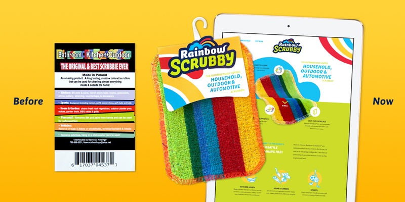
But it has never officially had a brand name. Consumers often referred to it as the “Rainbow Scrubby,” although those words did not appear together anywhere on the packaging.
We liked Rainbow Scrubby. It had all the hallmarks of a brand name: descriptive, memorable, simple and unique. Just like the product itself. Our brand name development team believed it was the way to go, and the client concurred.
We designed the new Rainbow Scrubby logo to appeal to its existing and prospective customer base. The logo design has a homey look, with a simplified tricolour rainbow emerging from a cartoon cloud, atop friendly custom lettering. The rainbow shape became a graphic element that designers could repurpose as a background on the website, packaging and collateral.
The old packaging was not much to look at. It was a simple rectangular card. And very busy, with too many words jammed together over a fairly painful mix of colours. It would be easy to beat, if we'd been happy to set the bar so low.
But the plan was bigger. A strong shelf presence topped the list, but we knew product differentiation and memorability was critical. With the new brand name and logo design, we were off to a great start on both fronts. Our new packaging design would need to leverage those assets and create desire by helping shoppers understand how indespensible and unique Rainbow Scrubby is—within a very small space.
Our die-cut design played on the product's rounded corners, and enables the new Rainbow Scrubby logo to bump out over the top of the wraparound label. We moved the UPC code and supplementary info to the reverse side, where buyers could learn more once we had won their interest.
The Rainbow Scrubby website design was next. We designed the site to be fully responsive, with unique designs optimized for desktop, mobile and tablet devices. It's a very small website, but plays a critical role in generating wholesale orders as well as online sales direct to end users. The packaging graphics, along with the playful icons we designed to promote the product’s benefits, transitioned nicely to web.
It's all a lesson about simplicity in design. Even a very straightforward product can become cluttered and complicated by trying too hard. A professional branding team knows how to refocus on the basics.
And how good is Rainbow Scrubby? Try it yourself, and buy some as gifts. You'll be as impressed as we are. (The Graphos coffee mugs and keyboards have never been so clean!)
Interested in creating packaging and branding that dominates store aisles? Book your free, personal Packaging Design Boot Camp by clicking the yellow button below!
Laurier Mandin is the president and lead consultant at Graphos, the world-class Downtown Edmonton web design, branding and inbound marketing agency he founded in 1993.
Laurier Mandin is president of Graphos, the Edmonton web design company, branding consultancy and digital marketing agency he founded in 1993.
