
For 17 years, Dr. Derek Haughton has helped create unprecedented transformations for his patients, so we felt he deserved one of his own.
The downtown Ottawa chiropractor is preparing to open his brand new clinic, Ascension Chiropractic Health Centre, and sought branding and a website that would reflect the individual style of corrective spinal care he provides in his practice, along with the direct benefits in his patients' lives.
My Graphos teammates and I were inspired by a video Dr. Haughton had created (see it on the Ascension Chiropractic home page). In it he shares a life-changing lesson learned from his late father, and how it instilled in him that in life there is “so much more” to our health than many of us ever perceive.
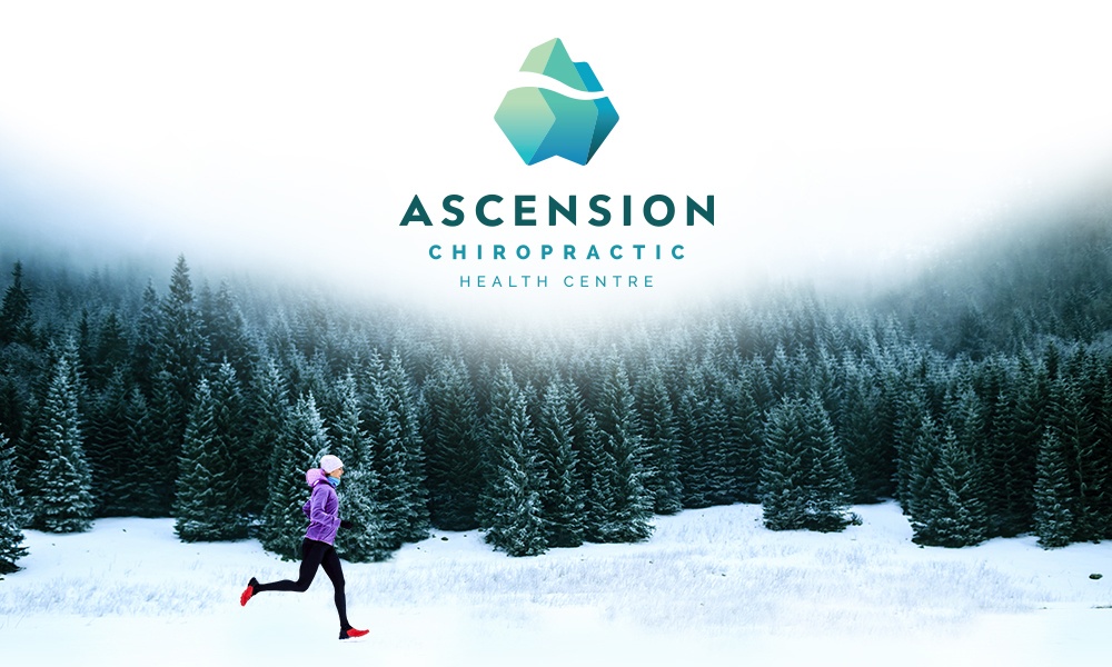
 There is so much more: It's a poignant phrase, and one that became the inspiration of the clinic's new logo and branding. We found in our research that most chiropractic clinic brands are centred around images of spines, backs and ... well, just spines and backs.
But while those elements are the literal focus of Dr. Haughton's work, they were just too commonplace in the industry. Used even in a novel way (to which end we made some good attempts), a spine or back image would achieve the opposite of differentiation, a brand's most important job.
During our brainstorming sessions, we kept coming back to the statement in the video. In a Eureka Moment, Graphos designer Laura altered her sketch of a mountain peak (which fit with the name Ascension and Dr. Haughton's love of the outdoors) in a way that transformed it into an iceberg. She gave the waterline the shape of a reclined spine, and stylized typography of the clinic's name to reflect the angles of the iceberg's base.
The client loved it.
The new logo design and branding, along with all the information gathered in our discovery phase, helped define the way the new Ascension Chiropractic Health Centre website looks and feels, including invigorating images, colours and design to convey Dr. Haughton's values and his focus on enabling patients to "live life full out." In writing the content, I sought to present the clinic's messaging in a friendly, inspiring way, evocative of Dr. Haughton's charismatic and highly approachable personality.
We applied the principles of responsive design to the logo, meaning that a different version of the logo art is appliead to specific screen sizes and applications. In a mobile browser, only the iceberg icon displays when the user scrolls down the page. In print, the full logo looks amazing, especially with the spot UV treatment we used on the clinic's new business cards.
The new Ascension Chiropractic Health Centre logo and website designs are unlike anything you'll see in the chiropractic industry. They're memorable, meaningful and distinct, just the way branding should be!
Laurier Mandin is president of Graphos, the Edmonton web design company, branding consultancy and digital marketing agency he founded in 1993.
