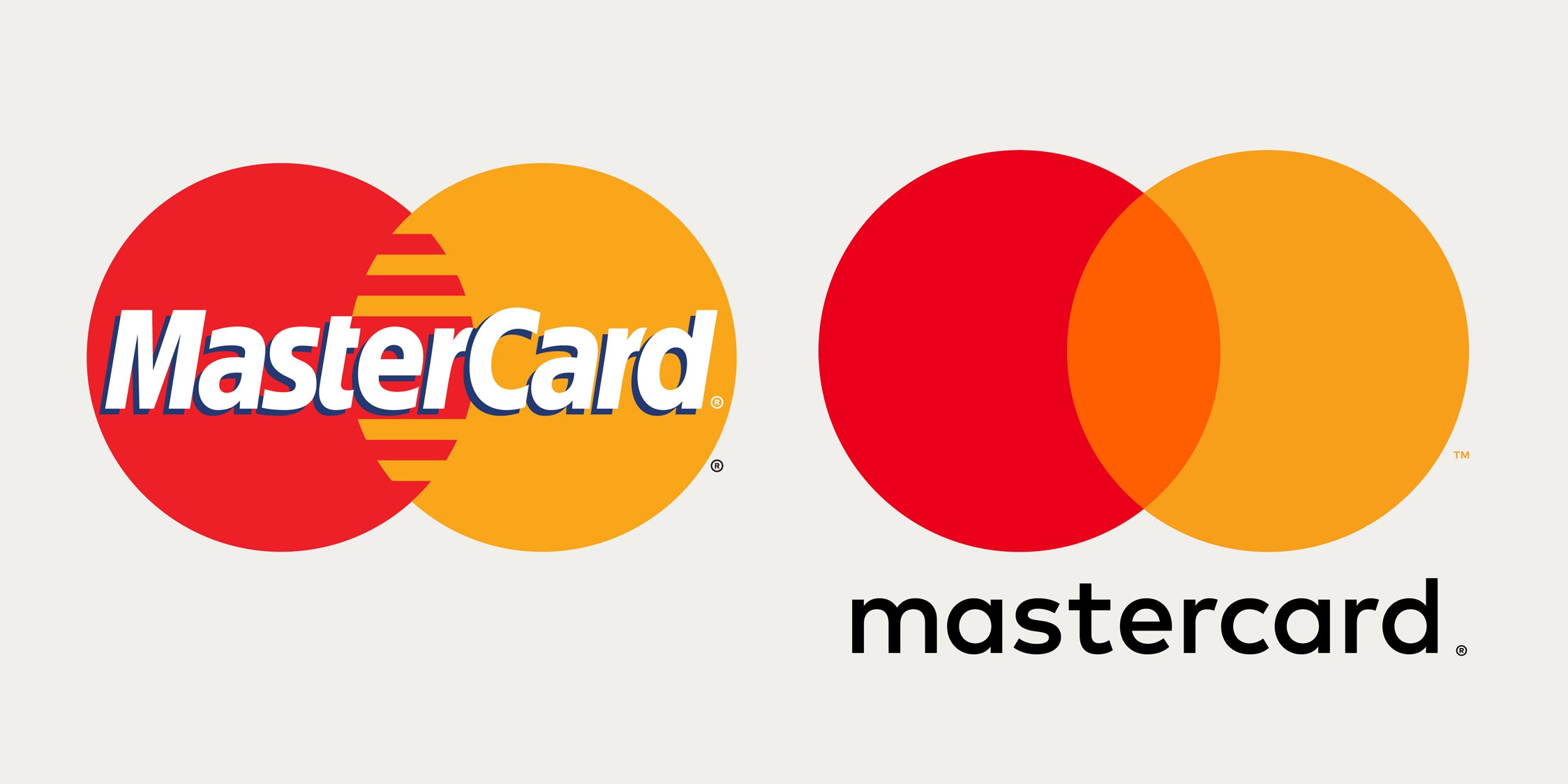
To hear my design team discussing the newly redesigned MasterCard logo, you might have guessed some preventable tragedy had just happened.
A lot of “why, oh why?” and “what were they thinking?”
I try not to (publicly) slam new logo designs when I haven’t been privy to the design brief, but I admit my initial reaction was along the same lines. The credit card giant’s first rebrand in two decades struck me as something a first-year design student might have slammed together under pressure, not the careful work of Pentagram, one of the world’s highest-profile independent studios.
MasterCard’s famous interlocking red and yellow circles had lost their comb-like weave, replaced by a bright orange additive colour mix. The brand name, long overlaid on the circles, had dropped below them where it was set in all lowercase, in a clean but fairly generic font called FF Mark.
So it’s not a terrible redesign, but hardly a dramatic or inspiring transformation. It felt like I had seen this logo before – and to a large extent we all have.

But being an armchair critic is cheap and easy. MasterCard spent a fortune reworking its most valuable asset, and had good reasons for even the smallest change. To judge it properly, we need context and an understanding of the redesign’s goals.
In short, here is what brand owners can take away:
1.Brand Around Digital
Over the half century since the MasterCard brand first appeared, banking and payments have changed vastly, but never so dramatically as in the past 36 months. “Today, it is all about connected-consumers, and digital is at the heart of enabling practically everything they do in all spheres of their lives,” says MasterCard’s Chief Marketing and Communications Officer Raja Rajamannar. For the first time in the brand’s history, digital is at the forefront and not a peripheral application of the logo.
2. Think of Future Customers, Treasure Old Ones
As a new generation of shoppers grow into credit card qualification age, MasterCard must be prepared. Brand equity means less to those consumers, who are early adopters turned on by what’s new – not their grandparents’ credit card. At the same time, money belongs to the old guard, whose hard-won trust shouldn’t be sacrificed for coolness. It took discipline and wisdom not to push for a trendy new look that targets millennials. The new logo’s “sameness” is much more about reassurance to longtime customers than preparedness for a fully digital future.

3. Standing out is Crucial
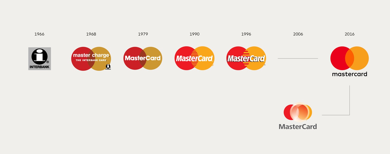
MasterCard’s logo most evident changes all contribute to making the brand stand out more than before (and more than competitors) in its most commonly seen application next to on credit cards: on storefront window decals. The re-engineered colours are overall punchier, and by separating the brand name from the icon, neither element can compromise the other’s readability. Lighter colours like yellow tend to make knocked out type harder to read (an issue targeted in the 1996 redesign with the addition of a drop shadow), a problem worsened by fading in the sun. Standalone type is a better solution, and lets the brand’s most recognized elements seen unobscured.

4. Plan Ahead and Brand Ahead
The MasterCard logo is charged with more brand equity than almost any on earth. Yet after two hugely transformative decades it spoke to an era unattuned to the age of digital banking. Emerging systems like Apple Pay and Google Wallet that work with MasterCard among others, are cardless.
Putting a lowercase on “Card” was not merely a return to the 1968 style, but serves other purposes in the brand’s messaging, including a way to use circular elements (a through-line of the new branding) in all 10 letters. The overall redesign is largely a study in how to make multiple forward-thinking changes without discarding past investment.

Love the result or not, MasterCard’s challenges, and the carefully executed choices are packed with lessons for any brand contemplating its place in a digital future.
It’s important to remember that MasterCard had a carefully laid foundation, with billions in equity at risk. For some businesses, sticking with busy, tarnished, or tired old logo could be the worst possible idea. Check out Laura Erickson’s excellent post about planning a logo design update or redesign for insights that can help guide your decision on how far to go.
And as the MasterCard logo redesign shows, it can be invaluable to consult with an experienced branding and logo design agency for objective feedback that considers the myriad factors that come into play when marketing in the digital age – balanced with the right measure of preservation for your brand’s equity.
For a free pro branding boot camp, in person or by video conference, hit the button below.

Laurier Mandin is president of Graphos, the Edmonton web design company, branding consultancy and digital marketing agency he founded in 1993.